








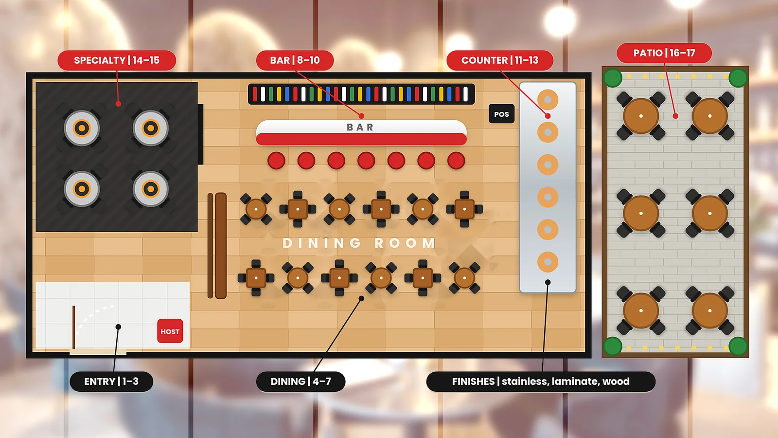
Good restaurant interior design does two jobs at once: it tells guests what the place is before they read a menu, and it makes the room easier to run. The ideas below come from restaurants we designed and built across Dallas-Fort Worth, grouped by zone, with the fabrication and layout decisions behind each one. Use them as a checklist for your own space, whether you’re opening a first location or refreshing a room that’s fallen behind the brand.
Most interior design articles show rooms nobody involved ever built. These are different. Every example is a project that passed inspection, opened, and is serving guests in DFW right now, and the notes include what it took to make the idea work in a commercial space: materials, clearances, ventilation, and cost trade-offs.
In this guide
Entry and First Impression
1. Reorient the entry to where guests actually arrive. Shun by Yama in McKinney had a building whose natural front faced a parking lot while the park-facing side was treated as the rear. We flipped the entry sequence so guests arrive from the side they want to, and the whole room reads correctly from the first step. The lesson for any space: the door the architect drew isn’t always the door your guests use.
2. Put the brand on the wall in material, not vinyl. Asian Mint‘s waterjet-cut “Ancient Money” logo was developed on an earlier build and now carries across every location. Ebesu‘s branded features were waterjet-cut from metal in our shop. Cut metal reads as permanent in a way printed graphics don’t, and it survives years of cleaning.
3. Give the host stand room to work. A stand placed in the door swing creates a line outside while the entry sits empty. The stand belongs where the host can see the door and the room, with standing space that doesn’t block servers.
Dining Room
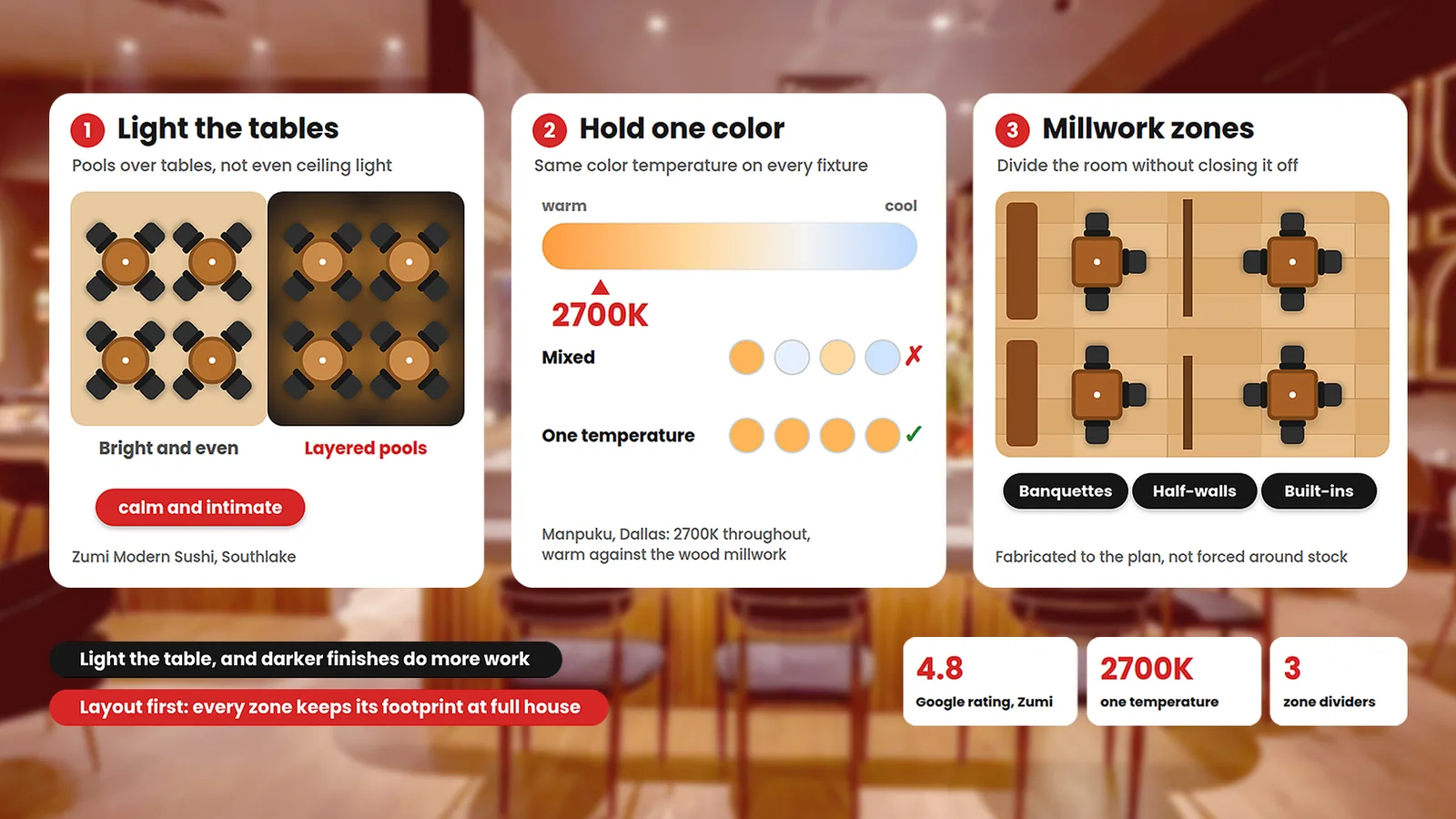
4. Light the tables, not the ceiling. Most casual rooms are lit bright and even. Zumi Modern Sushi in Southlake went the other way: warm, layered light with focused pools over individual tables and deliberate highlights on the custom fabrication. Darker finishes let the light do more work, so each table feels like its own space. Guests describe the result as “calm and intimate,” and the restaurant holds a 4.8 Google rating.
5. Choose a color temperature and hold it. Manpuku in Dallas runs 2700K throughout, which reads warm against the wood millwork. Mixed temperatures across fixtures make a room feel unfinished even when nothing else is wrong.
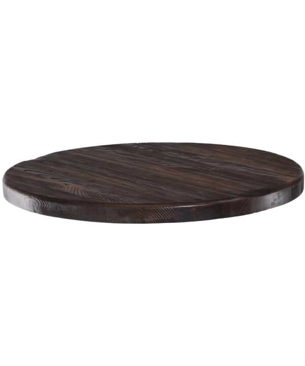
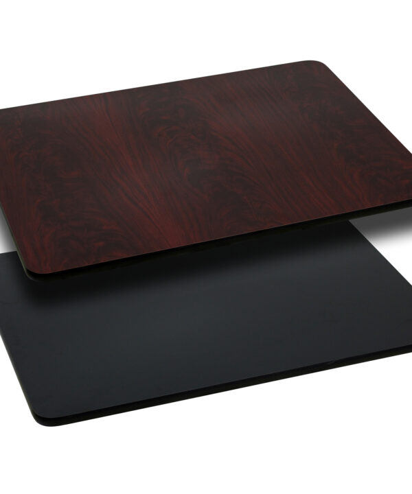
6. Let millwork define the zones. Banquettes, half-walls, and built-in dividers separate a dining room into sections without closing it off, and they’re fabricated to the plan rather than forced around catalog stock. Our custom millwork shop builds them with commercial-grade cores and high-pressure laminates sized to the wall they were drawn for.
7. Make a small room read as spacious by solving the layout first. Asian Mint’s Addison location fits a waiting area, a bar, and a main dining room into a tight footprint. The trick wasn’t finish; it was giving each zone a defined footprint that holds up during a full house, so guests never notice the building is small.
Bar
8. Build the bar as a working station. Front bar, back bar display, underbar equipment, and drink rail spacing planned together, so the bartender moves less and the display sells. Zumi’s two bars were built from scratch this way: a fully operational sushi bar with its workstation and flow, and a wet bar that anchors the room.
9. Use backlit panels for depth. Zumi’s lounge uses arched backlit panels behind the wet bar. Backlighting adds depth without adding fixtures in the sightline, and it photographs well, which matters for a concept judged on atmosphere.
10. Separate the counter experience from the bar experience. Shun by Yama keeps the intimate omakase counter functionally separate from its expanded indoor and outdoor bar areas, so each one feels intentional. One room trying to be both ends up being neither.
Counter and Service Line
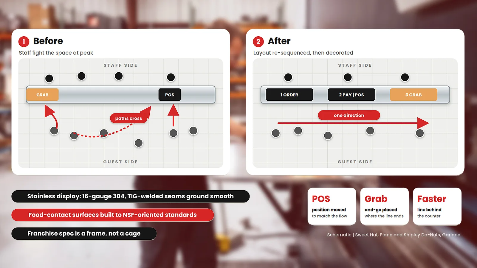
11. Re-sequence the counter for the rush before you decorate it. Sweet Hut in Plano had the product and a loyal following. The counter layout, POS positioning, and grab-and-go placement were re-sequenced so staff stopped fighting the space at peak, then the front-of-house was rebuilt around a modern, minimalist look with enough warmth to hold guests. Ownership reports daily compliments and a faster line behind the counter.
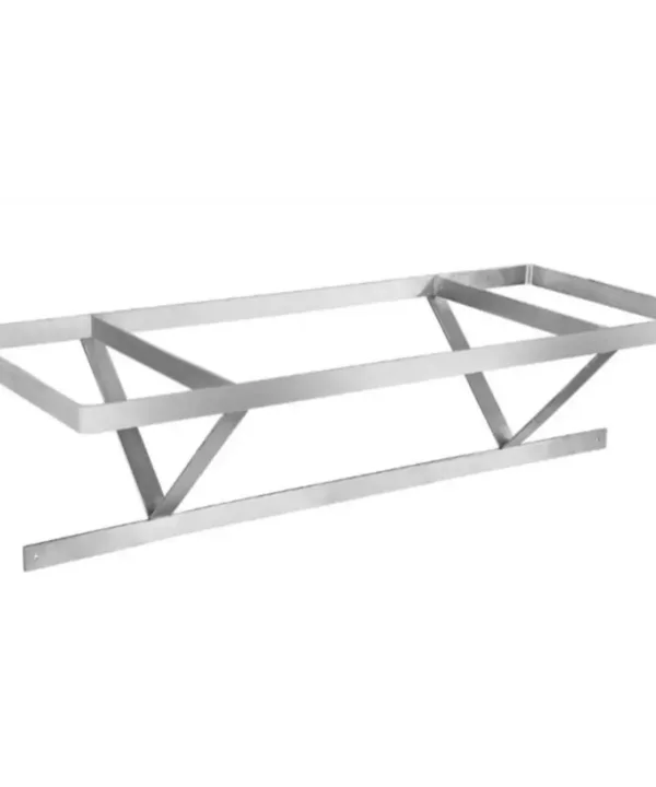
12. Display in stainless. Shipley Do-Nuts in Garland uses stainless display racks behind the order counter: durable, cleanable, and part of the look. Our stainless work is 16-gauge 304 with TIG-welded seams ground smooth, built to NSF-oriented standards on food-contact surfaces.
13. Use the franchise standard as a frame, not a cage. Shipley’s tile band, menu boards, and POS positions followed the franchise spec. The window seating and the stainless line made the location work for its operator. Franchise builds leave more room for good design than most operators expect.
Specialty Rooms
14. Engineer the ventilation into the design. Manpuku’s dining room has a smokeless downdraft grill at every seat, with a ventilation system balanced for the grill load so the room stays comfortable from the first table to the last. Ebesu’s commercial ventilation was designed to perform at full kitchen load without disrupting the dining room. In both cases the air handling was a design decision, wrapped in millwork and lighting so guests see the room, not the ductwork.
15. Convert the space, don’t fight it. Ebesu was a dated retail layout built for display and browsing. Zumi was a fast-casual salad shop with bright even lighting and no bar infrastructure. Both became upscale Japanese concepts by reworking the floor plan from the kitchen out, then building the finishes to match the new use. A second-generation space can become almost anything if the layout is solved first.
Exterior and Patio
16. Carry the concept past the front door. Sweet Hut’s redesign included a new facade and signage so the storefront matched what guests find inside. The old building and footprint stayed. The street read changed completely.
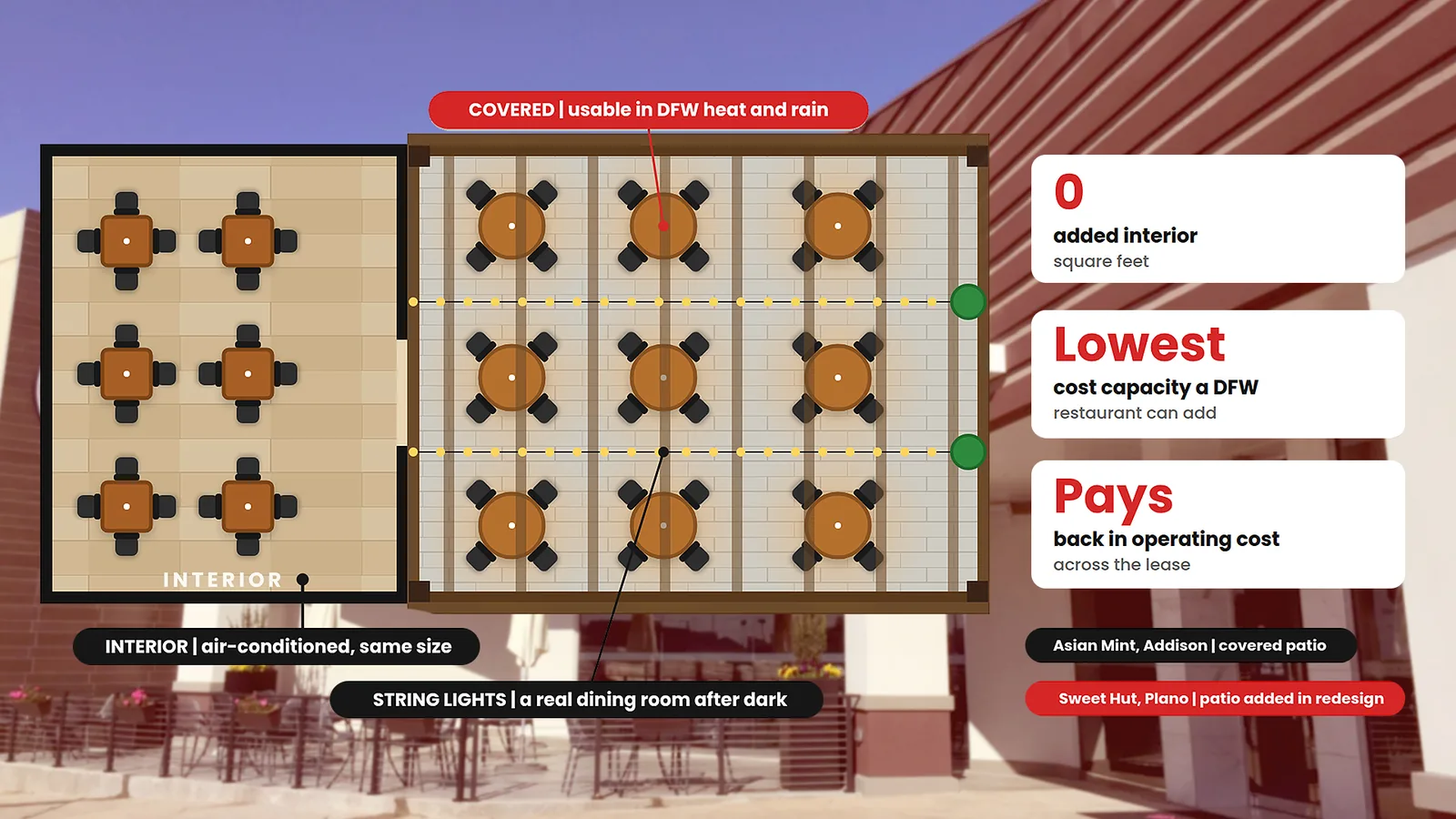
17. Add a patio for capacity you don’t have to condition. Asian Mint’s covered patio expanded usable dining without adding interior square footage, which pays back in operating cost across the life of the lease. Sweet Hut’s patio didn’t exist before the redesign. In Dallas-Fort Worth, outdoor seats are the least expensive capacity a restaurant can add. Our guide to low-budget outdoor restaurant design covers the patio side in more depth.
Choosing Finishes That Survive Service
Renderings don’t get inspected. Finished rooms do. The finishes we specify are chosen for health-code cleanability first and appearance second, which in practice means high-pressure laminates and sealed surfaces where hands and food go, stainless where heat and water go, and wood and softer materials where guests sit and look. Every one of the rooms above was field-measured before fabrication so the casework fits the wall it was drawn for, and every one passed inspection and opened.
If you’re starting from a floor plan rather than a finish board, our guide to restaurant layouts and floor plans covers the numbers that govern the room before any of this gets chosen.
Design and Build From One Team
Each project above was designed, fabricated, and built by Restaurant Headquarters. The waterjet panels, the bars, the stainless, and the millwork came out of our own shop while permits moved through the city, and the same team that drew the room built it. That’s why the ideas here carry fabrication notes most design articles can’t offer. Our restaurant design and build page covers the full scope, and the portfolio shows every room in detail.
See what your room can become
Tell us about your space and your concept. We’ll show you what the room can become and what it would take to build, or call (972) 487-8888.
Frequently Asked Questions
What makes a good restaurant interior design?
A room that tells guests what the concept is before they read the menu, and that makes service easier to run. Lighting aimed at tables, millwork that defines zones, a bar planned as a working station, and finishes that survive cleaning do more than decor. Every example in this guide is a Dallas-Fort Worth restaurant Restaurant Headquarters designed and built.
How much does restaurant interior design cost?
It depends on scope, square footage, and finish level, so Restaurant Headquarters prices from a locked scope rather than a rate sheet. A free consultation ends with a defined scope and budget before construction starts. For planning ranges, the Texas restaurant cost guide on this site covers DFW build-out costs per square foot.
What are the restaurant design trends for 2026?
Warm, layered lighting instead of bright even rooms; cut metal and millwork carrying the brand instead of printed graphics; open counters and chef's bars as the main attraction; patios treated as real dining rooms; and second-generation spaces converted rather than built new. All five show up in the Dallas-Fort Worth projects in this guide.
How do you design a small restaurant interior?
Solve the layout before the finishes. Give each zone a defined footprint that holds up at full house, use millwork rather than walls to separate them, light the tables rather than the ceiling, and add a patio if the site allows. Asian Mint in Addison fits three zones into a tight space this way.
Should a restaurant hire an interior designer or a design-build firm?
A designer produces drawings and a finish board; a design-build firm produces drawings, fabricates the millwork and metal, and builds the room under one contract. For a restaurant, where the bar, counter, and kitchen have to work as hard as they look, one team through construction means the design that was drawn is the design that opens.